The challenge
Health benefits are hard to explain. A small business owner, a growing company and a solo gig worker all want different things, and most of them have no interest in reading about plan structures.
The site had to get each of them to a page written for them, and then to a quote, without making them feel lost on the way.
The solution
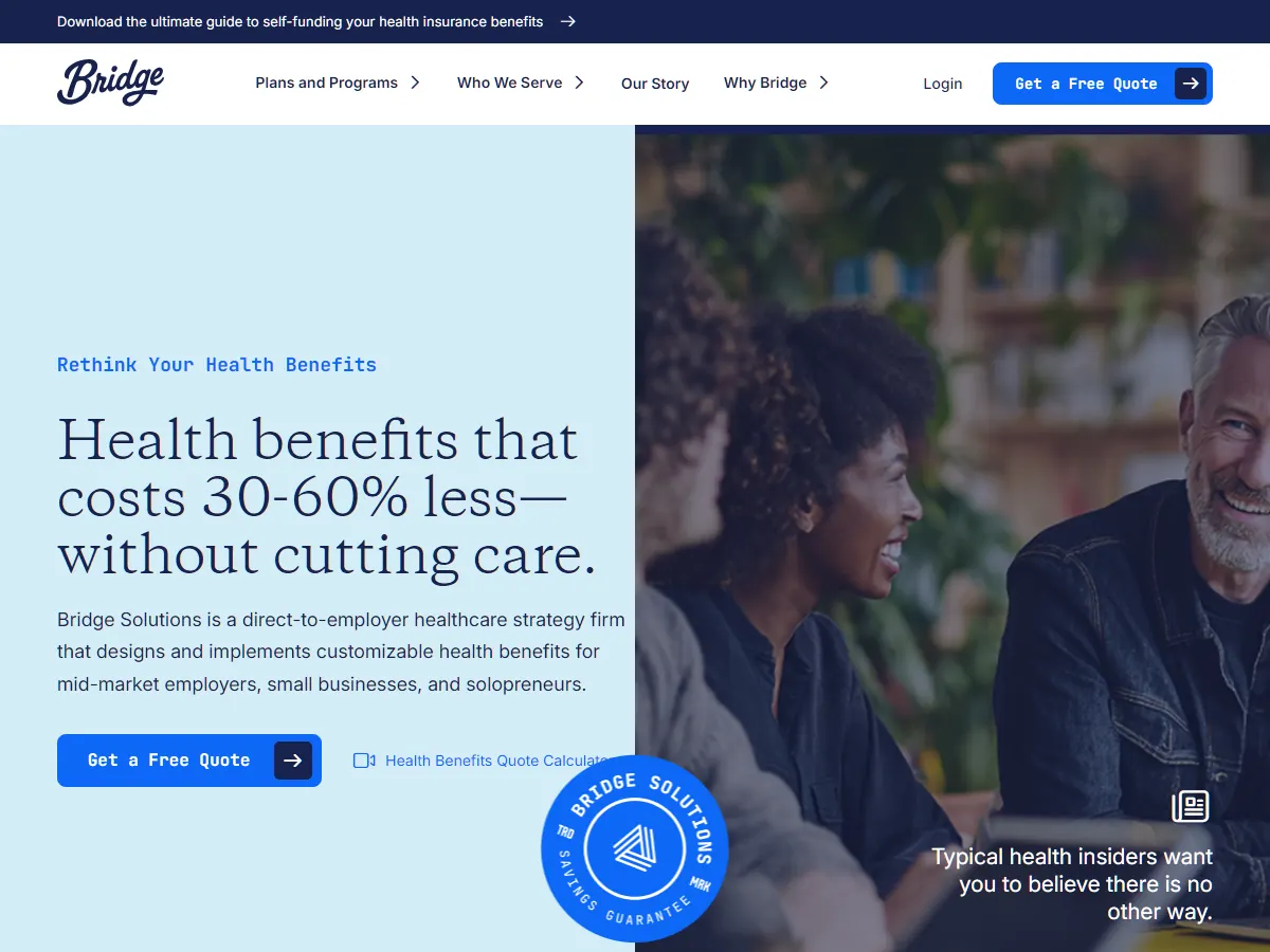
This project grew over several rounds, starting with a small first version in 2025. The largest build has 18 pages: separate pages for each plan type, including level-funded, share plans, Section 125 and supplemental benefits, plus one page each for small, growing and established businesses and solo workers. On top of that there is a plan comparison, FAQ, blog layouts and a quote form that leads to a results page.
The home page was also built in baby blue, light blue and navy versions so the colour could be compared on the real layout.
Other rounds covered login, registration, email verification and password reset screens, a quote dashboard, an employee dashboard and an enrollment page.
Results
- A clear route for each type of buyer, from first page to quote
- Separate pages for each plan type and each kind of business
- Colour options compared on the real layout, not on mockups
- Login, verification and dashboard screens built as well